 2024-11-17
 ️115 Views
 ️Vladimír Michl
The History of the Autodesk Logo
Do you know the story of the Autodesk logo?
Do you know the history of the Autodesk logo? Since its founding in 1982, Autodesk has become one of the world’s best-known software companies over the decades. And like other multinational companies, Autodesk has updated and changed its visual identity several times over the years. Throughout all the historical transformations of the Autodesk symbol, the wordmark has remained a significant part of the logo, and the simple color palette has stayed true to conservative black, with brief forays into shades of blue and blue-green. Each phase of change reflected the company’s emphasis at the time on specific technologies or areas of focus, as well as its relationship with customers.
How it all started
Autodesk was founded in California in 1982 by John Walker and a team of programmers. Even back then, the company was developing software for technical drawings, which later evolved into AutoCAD—the most widely used CAD software to this day. In 1985, Autodesk went public, and its steady growth has continued ever since. Today, its solutions cover the areas of design and management in mechanical engineering, manufacturing, architecture, civil engineering, mapping, digital media, and asset management.
The original logo was based on the geometric symbol of a caliper, compass or protractor (chevrons), evoking the concept of design, combined with a distinctive serif font for the uppercased company name.
Makeovers - 1994
It wasn't until 1994 that Autodesk made a minor change to its branding. The caliper symbol remained, but it was scaled down and moved to the left side of the highlighted company name. The name itself also changed from uppercase to a more legible lowercase form, with even more pronounced serifs.
Digital internet transformations - 2000
In 2000, the world was completely swept up in Internet fever, the Y2K “threat,” the dot-com bubble, and other trends. Companies were frantically changing their identities to be as “trendy” as possible and ride these waves. Autodesk was no exception. The completely redesigned and significantly simplified blue logo, featuring a bold sans-serif font, was meant to convey the company’s focus on the Internet, ease of use, and the reliability of its tools.
Return after the bubble - 2005
After the dot-com bubble of the turn of the millennium burst, Autodesk partially reverted to its earlier logo design, featuring a black-and-white color scheme and a distinctive serif font, though without the compass/caliper symbol. After all, its 3D CAD tools at that time had already moved on. This phase was briefly preceded by a blue version of the logo.
We're all “eco” - 2013
Another wave of craziness hits full force in 2013. Everyone is eco-friendly, organic, and woke. Autodesk tries to reflect this trend with natural colors and by adding an origami symbol (ribbons shaped like a stylized “A”) to the wordmark, this time using a sans-serif font (based on the Artifakt typeface).
Technology - 2021
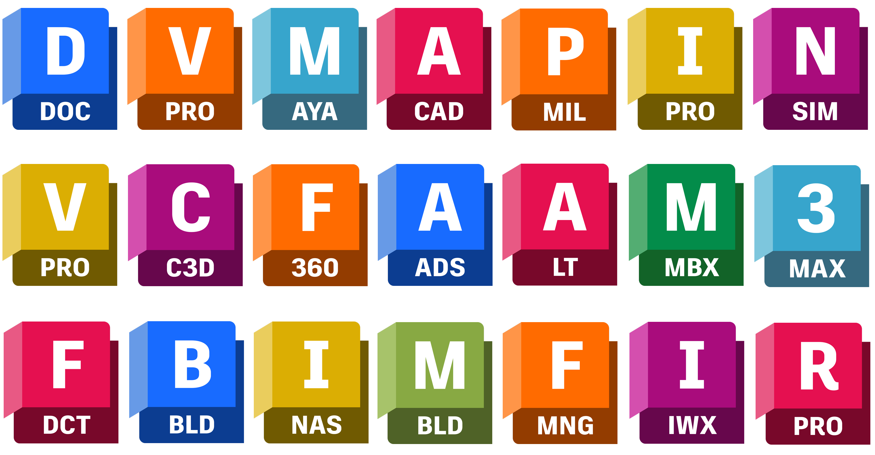
With Autodesk’s growth and the expanding range of tools it offers, technology is (finally) taking center stage once again. Its focus on customers who create, invent, manufacture, and innovate is expressed by a new, dynamic, and ambitious symbol (based on a 3D shape, once again a partially stylized “A”), which returns to the logo in front of the company name, in a black-and-white version, in a bold, robust sans-serif typeface. With this new logo, Autodesk has also expanded its visual identity to include a sophisticated set of colors and symbols representing its individual software product lines.